

3 Ways to Achieve Slide Symmetry
三個有效方法,讓畫面整齊有序
In this article, we cover the bare basics of using alignment techniques. The simple concept of lining up slide elements will quickly enhance visual harmony.
本文我們將介紹對齊相關的基礎技巧。掌握簡單的投影片元素排列概念便能很快地增強視覺上的和諧。
When it comes to designing slides, it can be a tedious task. From changing fonts to adding photos, we try to boost the looks of our presentations. However, our slides still do not end up resembling those beautiful templates we find online. One basic way to deliver a cleaner slideshow, is paying attention to alignment.
設計投影片是一件很繁雜的事,無論是調整字體還是插入圖片,我們都盡力想提升頁面的美觀度,但最終會發現總是無法像網絡上的模板那樣好看。其實呈現一份清楚的簡報,對齊是很基本的原則。
Here are three basics ways to line-up slide objects:
以下介紹三個基礎方式讓頁面物件對齊。
1. Guides 輔助線(參考線)
Before you start to design your slides, I highly recommend switching on the guide features under the “view” drop-down menu.
在製作簡報之前,我強烈建議先在打開「檢視」下拉選單中的「輔助線」功能。

*PowerPoint
The guides will immensely improve your visual coordination and support your design ambition. The following options will give you these abilities:
輔助線可以在支持你發揮設計功力的同時極高的保證和提高頁面的協調。輔助線有三種不同的功能:
a. Dynamic Guides – These guides are the red dotted lines that will pop up when you are moving objects around, which tell you if you are lined up and spaced evenly. It will also automatically snap objects in place.
動態輔助線 – 開啟這個功能,在移動物件過程中會出現紅色虛線,提示是否有排列整齊和間隔均勻,它還會自動讓物件到位。
b. Guides – This option will fix two grey dotted lines down and across the middle of each slide. It will help you gauge the symmetry and weight balance of content per slide. The four quadrants will help you visualize if one area of your slide has too much content versus the others.
輔助線 – 開啟這個功能,頁面中間會出現兩條交叉的固定灰色虛線,協助你衡量每張投影片的對稱和平衡。通過劃分出的四個象限,便可以很清楚地看出頁面哪一角落的內容過多哪一區域內容過少。
c. Snap to Grid – Along with the dynamic guides, the snap option allows you to move content freely. However, it will move at even incremental spaces, instead of full free motion. This way you can eyeball alignment between objects.
貼齊格線:這個功能和動態輔助線一起使用,可以自由地移動內容物。這樣就可以看到物件之間的對齊了。
This drop-down menu is a great starting point to utilize when organizing slide elements. Another way to access these tools is by right-clicking on the slide, and finding “guides”.
這個下拉選單是幫助我們排列組合頁面元素很好用的起步工具。除了在工具欄中,還可以在頁面單擊右鍵找到這個工具。
2. Auto-alignment 垂直置中
This feature is a design freebie, and can be done in a few clicks! You can select the objects you want to line-up, then experiment with all options. It all depends on how you want to position each slide’s elements.
這個功能不需要用到設計能力,只需要進行簡單地點擊。選取所有想要排列的物件,選擇你想要呈現的樣式即可。

*PowerPoint
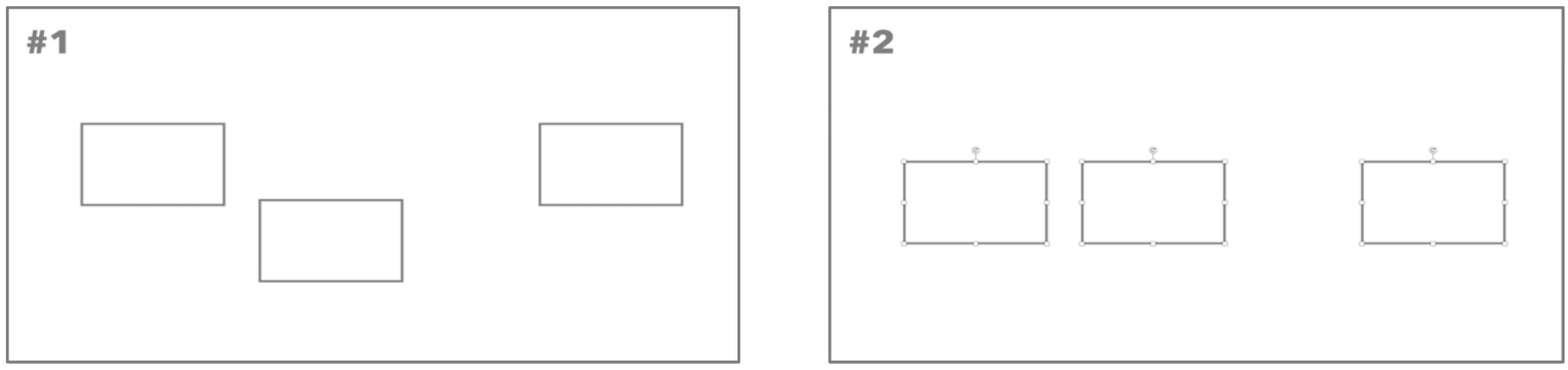
For example, the screenshots below show us the “align middle” in action.
示意圖展示了「垂直置中」。
*PowerPoint
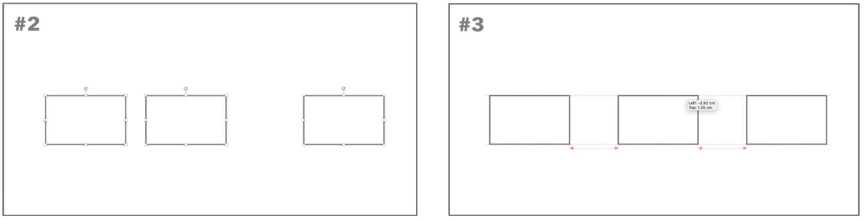
The “align” function is super simple and helps us quickly line-up objects based on our position preference(s). Next, is the “distribute" tool, which takes things to a whole new level. This feature will control and evenly space objects apart from each other.
「對齊」協助我們根據排列偏好迅速調整物件位置,且操作十分簡單。接下來是「分散」這個工具,它負責把物件均勻地間隔開,把我們的畫面帶到另一個高度。
*PowerPoint
The automatic alignment and distribution tool is an easy approach to quickly organize your presentation slides. There is no manual drag and drop of objects, but rather a simple select and click.
無需手動拖放相關物件,只需進行簡單的選取和點擊,自動對齊和發散工具實在是快速組織排列簡報的簡單方法。
3. Ruler Lines 尺規線

*PowerPoint
The ruler tool can be helpful in assisting manual guides. You can right-click on the slide and go to “guides”, then “add vertical guide” or “add horizontal guide”. Then, that guide can be freely dragged to any point of the slide. This allows you to line up things in any fashion you desire.
尺規工具讓手動輔助線讓直觀。通過點擊頁面右鍵來到「輔助線」,選擇「新增垂直輔助線」或「新增水平輔助線」。這些輔助線可以自由拖動,幫助你實現任何方式的排列。
Keynote users also have an abundance of sources to create visual harmony. As far as alignment, the ruler (⌘R) tool is quite resourceful.
Keynote 用戶也有豐富的資源可以做到視覺和諧。就對齊而已,尺標(⌘R)是十分靈活的工具。

*Keynote
You can simply drag yellow guides from the left or top side, and freely place them as you please. In addition, Keynote also has dynamic guides and distribution options similar to PowerPoint. You can find these options under the “view > guides” menu, and formatting area.
只需要從頂部或左側拉出黃色的輔助線,隨意擺放即可。和 PowerPoint一樣,Keynote 也有動態輔助線和分散功能。在 「顯示方式」>「參考線」中可以找到。
Overall, these key approaches are quite effective, while not requiring design skills. Additionally, they are relatively easy to apply. Utilizing them to create more visually-friendly slide can go a long way. Try them out next time!
總體來說,這些方法都十分有效,且不需要設計技巧。此外,它們相對容易使用。使用它們去創造更多視覺舒服的簡報,下次一定要試試看!
本文作者:BFA 簡報 編輯部