A New Perspective on PPTs
新視角解讀投影片
A simple approach to planning effective presentations for multiple scenarios. From academic projects to weekly business meetings, a PPT can equip you with more than just visual support.
一個簡單的方法幫助規劃一場有效的簡報,適用於各種情境。
When we have meetings, speeches or any other type of presentation… PowerPoints are the go-to delivery tool. However, we often depend too much on slideshows, and end up with mediocre results. The “power” of PowerPoint has dominated multiple settings ranging from classrooms to corporate offices. According to findings, majority of professionals identify PowerPoint as “standard” and “easy”.
當有會議、演講或是其他類型的分享,投影片常是適合用來傳遞資訊的工具,但我們卻過於依賴它,導致結果不盡理想。投影片的威力似乎已經主宰了很多上課或是工作場合。數據顯示,大部分的專業人士認為投影片應該是一個簡單普通的工具;另一個研究表明,33.3% 的講者會在設計投影片之前擬好內容綱要,32.4% 的人則是同步做這兩件事。
If we start working in PowerPoint, we potentially restrict information quality and analytical thinking. At times, we may gather all content and forcefully fit them into slides limiting creativity. Also, rash slide designs may cripple content logic and/or visual aesthetics. Furthermore, we practice our presentations by reviewing what is solely in each slide. Let’s face it, most of us are dependent on our trusty sidekick, “Captain PowerPoint”.
如果準備簡報的一開始就先製作投影片,那會潛意識地限制了我們處理資訊的方式,容易將蒐集到的所有內容強制放進一頁受限的投影片中。這樣粗糙的投影片設計也會削弱內容邏輯和視覺美感。此外我們練習的時候只是單純地回顧每一頁面的內容,不會整體性全面性地去練習。我們必須承認,人們有些過於依賴投影片了。
In building a basic or top-notch presentation, proper planning is definitely a must. Trying to find the right balance of productivity between content, slides and preparation can be challenging. Since, PowerPoint is so synonymous to presentation, I decided to rethink what .PPT really means. So, I broke down the acronym and built a simple linear process:
那些不錯的簡報都是在事前做了內容的雕琢,不過在內容和設計上取得平衡並不是件簡單的事。然而,現今的投影片幾乎成為簡報的代名詞;因此,接下來將從文字方面來拆解意涵 - 投影片 (PPT),用簡化的線型過程來跟大家分享:
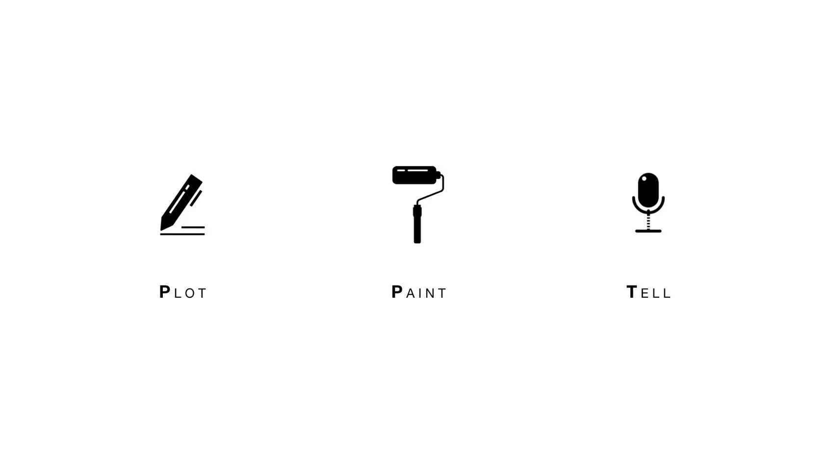
P – Plot your story (clear message, content)
P – Paint your story (creative + clean design)
T – Tell your story (effective communication)
P-Plot 策劃、佈局故事 (清楚的訊息、內容)
P-Paint 描繪故事 (創造性 + 乾淨利落的設計)
T-Tell 敘說故事 (有效的溝通傳遞)
[P]LOT – This segment focuses on the collection, organization and outlining of all relative content. What is the core message? What is the “plot” to your story? Of course, based on what scenario you are facing, you are not creating an all-out and heavy-content narrative. However, piecing together content with storytelling elements.
Plot – 這一步的重點在於搜集、組織和概述所有相關的內容。核心訊息是什麼?故事的情節點是什麼?這取決於你所面對的情境。我們並不是單純地把一個故事的內容鉅細靡遺講出,而是要將內容和故事元素相結合,有效率有節奏地帶出重點。
First, start by compiling all relevant information and content. Next, organize all content into logical groupings. Then, cut out any secondary information, or even consolidate by combining groups. Now, you can decide the sequence of your groupings. Remember, you can direct the emotions and interest of the crowd by strategically implementing and ordering your narrative.
首先,編排所有有關資訊和內容,接著把內容有組織地放進邏輯框架中,刪除次要的資訊。你可以決定這些內容組的先後順序。講者可以通過策略性和有組織的敘述來引導觀眾的情緒和興趣。
[P]AINT – After plotting, you should be able to deliver your message without visual aid. However, slides are extremely helpful in not only visualizing, but controlling your presentation flow. PowerPoint is your sidekick when it comes to providing cues, reminders and reference points. As for the listeners, you can enhance their content digestion and comprehension. Here are some existing approaches:
Paint – 在策劃後,你應該要做到在沒有視覺輔助下就可以進行演說。但因為投影片不僅僅在可視化上有很大的幫助,在控制演示流程上也大有幫助。投影片在提供一些互動、提示和參考上是不錯的幫手。對於聽眾來說,你可以加強他們對內容的理解和消化。以下是一些立即可用的方法:
10-20-30 Rule Venture capitalist, Guy Kawasaki, offers a simple method when it comes to PowerPoints in form of 10 slides, 20 minutes, 30 font size. Although, this concept is strongly geared toward pitching situations, and timing is unknown in other scenarios... The 10-20-30 rule is a good starting point, and time can always be adjusted.
10-20-30- 法則:「10 個頁面、20 分鐘講完、用 30 號的字號」是風險投資家 Guy Kawasak 做投影片的法則。這個概念主要使用於新創公司 pitch 的場合或是演講時間沒有明確規定的情境。不過 10-2-30 法則是一個不錯的起點。
6 Words You have heard the saying “less is more”, and in regard to PowerPoints, this certainly holds true. Business founder and blogger, Seth Godin, recommends no more than 6 words per slide. As cramming a bunch of text onto slides causes visual overloading, leading to weak comprehension. So, let most of the words come from your voice, while the slides post keywords with supporting visuals.
6 字法:一定很多人聽過「少即是多」,對於製作投影片來說這確實是對的。商業創始人兼知名部落客 Seth Godin 就建議每個投影片頁面不要超過 6 個單字。因為太多的文本內容會造成視覺疲勞,讓聽眾的理解力下降。所以,就讓更多的內容從我們的嘴巴說出,讓頁面僅有關鍵字和輔助的視覺就好。
C.R.A.P. A solid slideshow design is always full of crap. No, not that type of crap, but rather a guiding acronym: Contrast Repetition Alignment Proximity. When it boils down to pure design aesthetics, these four basic principles are game-changers. They promote eye breathability, to allow visual digestion of content. From lining up elements to spacing them consistently makes all the difference in visual harmony. The worst thing you can do is use PowerPoint and put no design value into it. Although, some consider splashing paint all over a canvas as art… Throwing content all over a slide does not quite mirror that effect.
CRAP:投影片應該要有對比、重複、對齊和親近這四個要素,它們拯救了視覺疲勞,讓內容可以從視覺上被消化。用投影片但沒有使用技巧對畫面進行設計,是最大的浪費。雖然有些人認為油墨潑布也是一種藝術,但內容都堆積在投影片上是沒有這種效果的。
[T]ELL – Now, you should be ready to convey your message with impact. After the time spent plotting and painting your masterpiece, you should be incredibly familiar with your contents. Therefore, the need to memorize your speech becomes a minimal task. At this juncture, you can go ahead and get creative with your delivery. For instance, working on a strong opening statement to build rapport with the audience. At this stage, you should be relaxed and confident in your materials. Moreover, you can focus on final touches and/or small adjustments.
Tell – 接下來要準備好透過影響力去傳遞資訊。在策劃和描繪作品之後,你應該已經對自己的內容瞭若指掌,所以記住演說的內容基本不成事了。在這一關頭,應該想辦法讓你的表達更有創造力和影響力。比如,為自己設想一個強有力的開場,建立好與聽眾融洽的關係。在這個階段,你應該對自己準備的材料很有信心!此外,可以想像怎麼做好的收尾或者哪裡可以進行微調。
Overall, PPTs are not presentations, but rather a presentation a process! Plot. Paint. Tell.
總的來說,投影片並不是一場簡報,而是一場演示中的佈局、描繪和述說。
本文作者:BFA 簡報


